
480+
Active clients
Case study

Atman is the inner light that guides us to self-awareness and harmony, infusing every moment of practice with true meaning and a deep connection to oneself.

About client
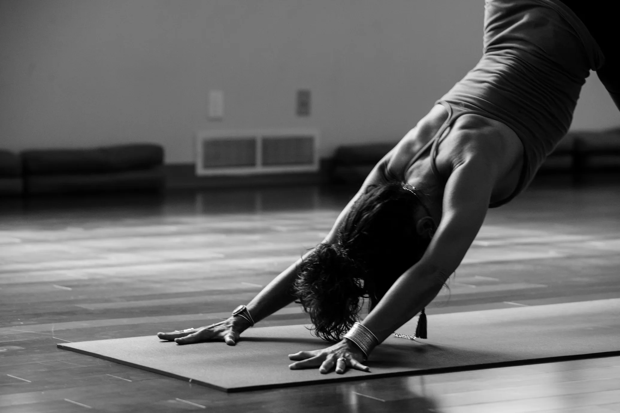
Atman Yoga Studio is a small, community-driven yoga space led by an independent instructor who runs group classes, private sessions and online practices. Before the project, most communication and bookings happened through messengers and manual spreadsheets, which took a lot of time and easily led to confusion.
480+
Active clients
4
Yoga instructors
50+
Curated playlists
Challenge
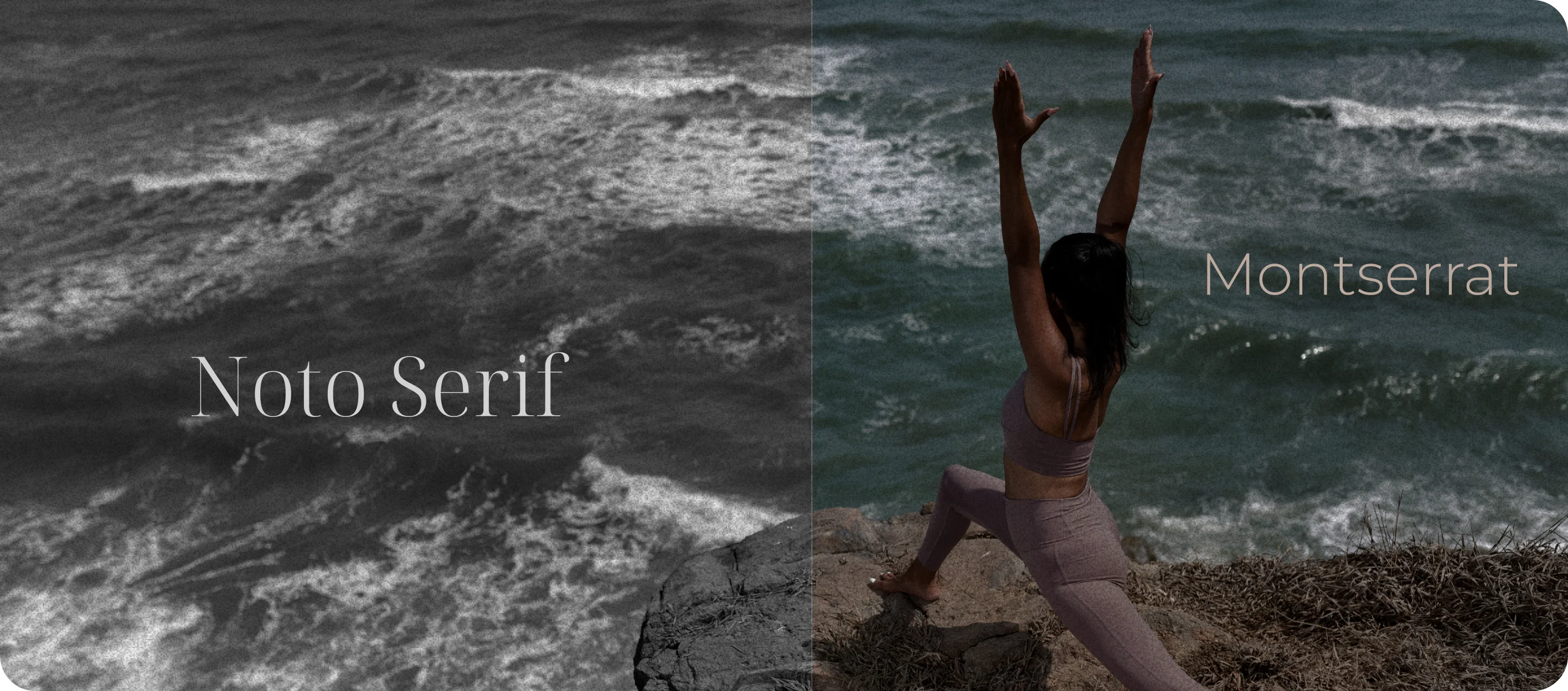
Noto Serif is an elegant and balanced typography, which conveys a sense of tranquility and harmony. Its refined serifs and excellent readability enhance the visual identity, creating a serene and trustworthy aesthetic.
Pallet that represents depth and the wisdom of tradition, like the roots of yoga, Colors create a balance between the spiritual and the material, perfect for a yoga-related website.
Transform your business: let’s take the next step together DoBroIT
Your business deserves reliable and modern IT solutions. At DoBroIT, we don’t just implement technologies — we help turn your technical challenges into opportunities for real growth. Tell us about your needs, and together we’ll find the ideal path for your company’s development.

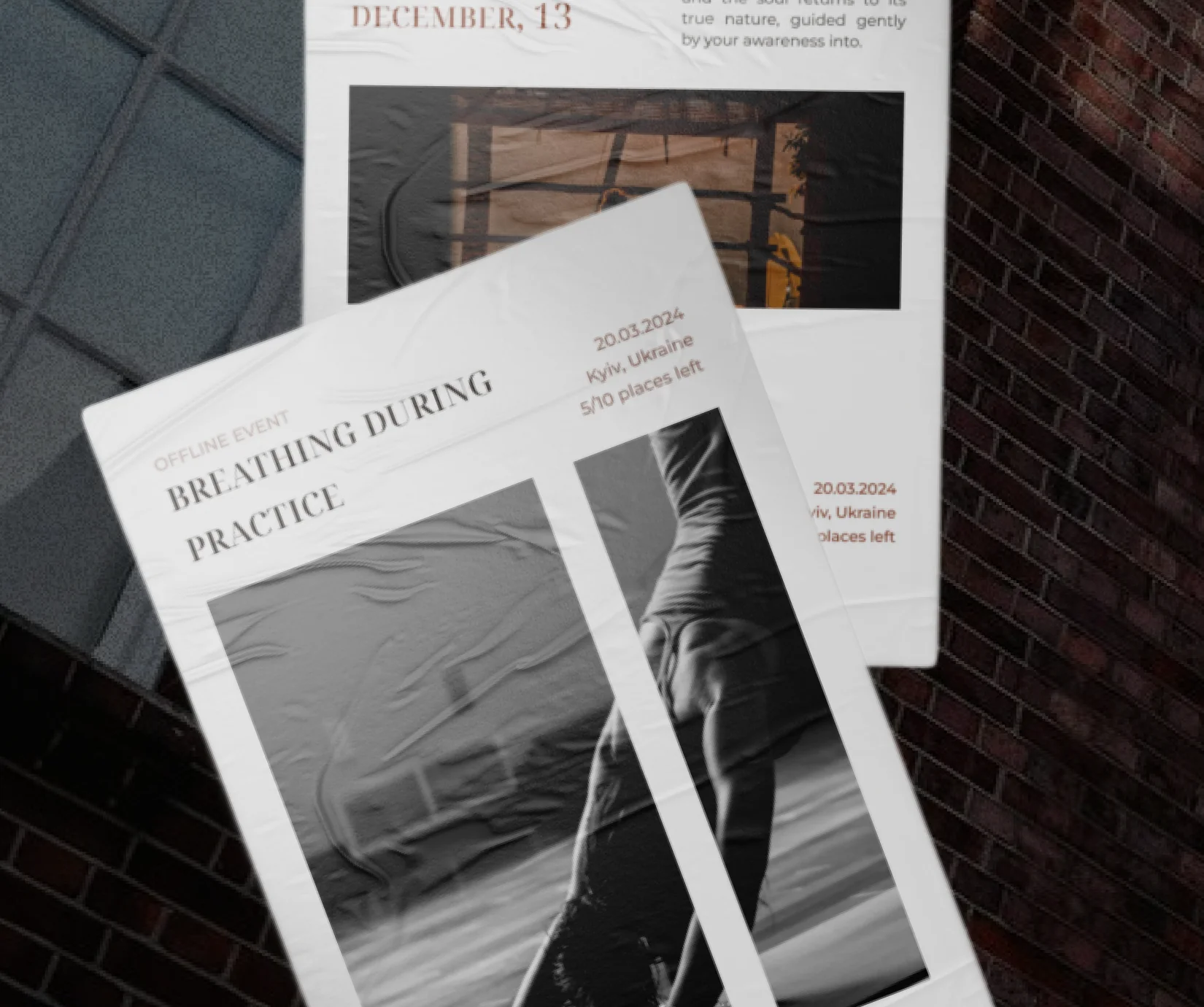
What we did
We started with love to the yoga studio which allowed us to align the branding the owner direction for future development
Mood board
Logo
Research
Modern typography
Yoga-balanced colors
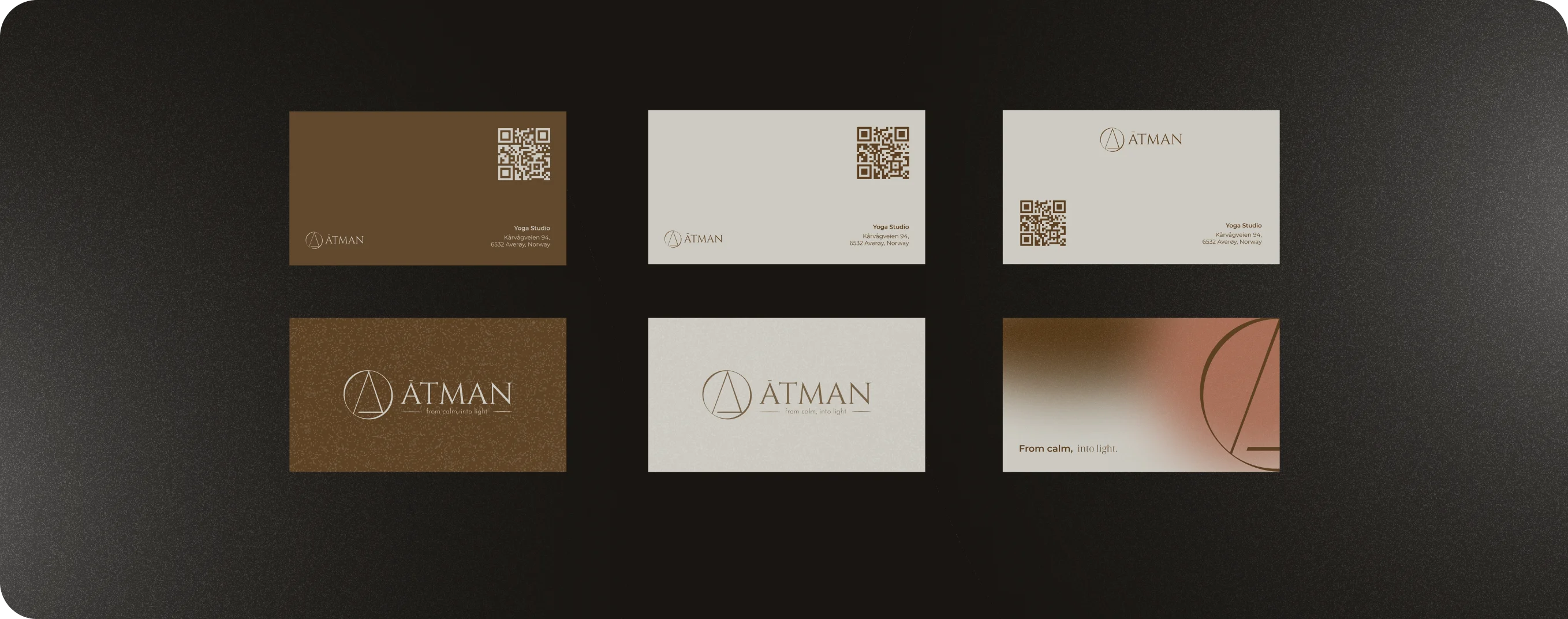
Branding materials that were prepared during a few weeks are reflecting the philosophy of the studio
View case study
Yoga instructor
All my wishes were taken into account, and the result exceeded my expectations
I would like to express my gratitude to the team for creating the yoga platform! I was impressed by your professionalism, creativity and attention to every detail. All my wishes were taken into account, and the result exceeded my expectations - the platform turned out to be modern, convenient and perfectly in line with my vision. I especially appreciate your speed of execution, openness to communication and willingness to offer the best solutions. I recommend your team to anyone looking for a high-quality and creative approach!
View project
Summary
Through carefully chosen graphic elements, we stayed aligned with the founder’s creative direction and translated it into a cohesive visual narrative for the brand.
Each element of the design and branding carries its own underlying philosophy, embedded in the context. This approach allows the brand to stay unique while still honoring its roots and traditions.
The logo reflects the studio’s name and encapsulates the core idea of the brand. It’s been designed as a flexible asset that works consistently across all touchpoints — from the website to printed materials.
Contact us


